Now I had to think about how big this booth would be and where it would be in the terminal. How big should the screen be and the distance between the screen and the participant.
I made a sketch of which elements should definitely be present in the booth. For example the screen, the arrows on the ground, but also a printer.
I based myself on this existing pop-up booth. The dance booth I’m going to make will have to be a little bigger so the participants can move.
Here is an example of the measurements of the dance booth. Then I thought about how big the arrows should be on the ground, and how far from each other they should be.
I soon noticed that these shouldn’t be too close together. The participants must have room to move.
Then I had to pour all this information into a concept video, so that it all became clear.
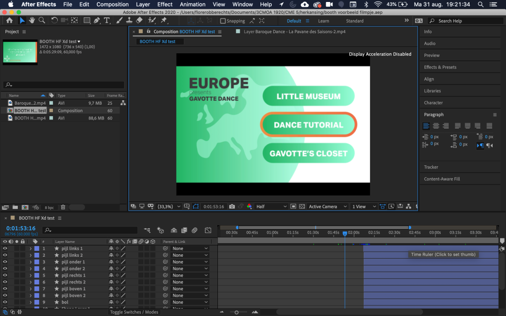
I used a recording I made of the wireframes in Adobe Xd and then refined it in After Effects with extra sound effects and music.
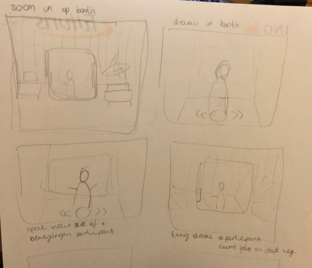
Then I made a storyboard and thought about how I could best bring this project to the table. I thought about making an animation of the booth on the terminal.
And then made some simple illustrations of the dance booth and the terminal.
At this stage it is also very important to test the prototype. This time I did it in a slightly different way. I asked the test subject to stand up behind the screen, and move as if he were standing on the arrows. Also here I explained the context of the app and the dance booth in advance. I told them that the screen reacts to movements of the participant.
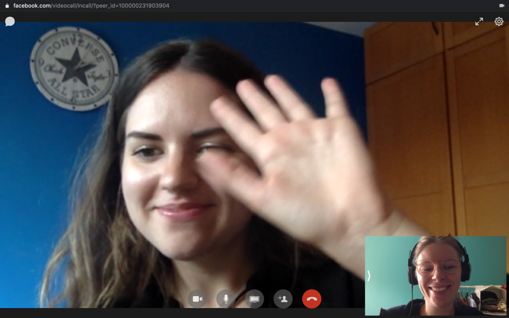
High-fidelity test: Lisa
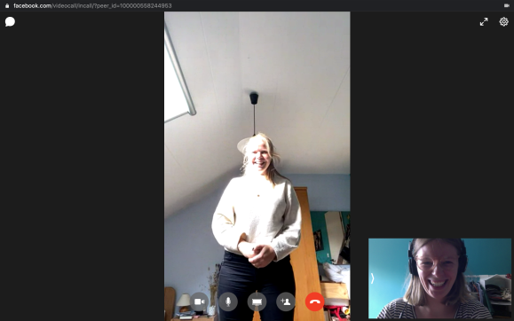
I did this test together with Lisa. She is 23 years old and makes a big trip every year. In between she does the occasional city trip or goes camping.
This test also took place via a video call. I asked her to stand up behind her computer. She had to tell me if she would jump, step to the left and so on. I asked her to stand up behind her computer. She had to tell me if she would jump, step to the left and so on. This because I controlled the app, every time she moved or said she jumped, I clicked an arrow button.
When we came to the screen of the explanation, she did the movements that came on the screen. She said that this was very clear and that she understood that this way she could control the screen.
She easily managed to scroll through the various menus and screens. First she chose the dance tutorial to do. She said it was good that the controls came up again. She imitated all the movements that came on the screen (also the arm movements). She did the whole dance and the length of the dance tutorial was good.
Then she chose the little museum. At first she didn’t realize that she could zoom in. But when the explanation came up again, she understood it completely.
Finally she chose the closet. Here she had some trouble with the navigation. She thought she had to jump to go to “body”. Here could be a repetition of the controls. She liked that you can get a picture at the end. This way you have a small memory of your trip.
This testing went very smoothly. It was clear that you can control the screen with simple movements. I did notice that it took a bit longer to navigate because you have to move all the time. But fortunately that is exactly the purpose of the booth. Move!
Adjustments I can implement in a next version of the app:
An additional explanation of the control at the beginning of the closet.
After testing a low-fidelity prototype I could start on a high-fidelity prototype. I made some adjustments to the user flow and threw it into the new branding. Then I made the prototype in Adobe Xd.
Then it’s time to create the branding of the booth. Because the screen of the booth is located in a closed space, I had to decide whether this space was rather dark or more light.
An example of what such a booth can look like.
Web and mobile interfaces are used in environments which may be pre-supposed as typical if the target audience is researched carefully. For instance, concerning constant use under natural light, a dark background can literally create the effect of reflection, especially on glossy screens typical for tablets and smartphones. On the contrary, in conditions of badly-lit environment, a dark background can take the light away from the screen which has a bad influence on navigation and readability. So, the issue of color combinations, contrast and shades draw big attention here. (Tubik Studio, 2018)
Since seeing someone doing it is still the best advertising, I’m going to choose to leave the booth half-open. So that means that natural light comes in, and I’d best go for a more light colored interface.
Colors
I definitely wanted to import green in the color palette. This because the dance booth is about cultures from all over the world. In a globe the continents are often colored green.
Eventually I came across this color palette. There is enough contrast in the different colors but they still fit together nicely.
Logo
I finally came up with the name Move for the dance booth. This comes from “you’ve got moves” but also from “move around the world”. So the element of dancing and traveling is combined here. Fot the typography I used Aktiv Grotesk.
Then I started sketching the logo. Soon I used a sphere as the main element. This stands for a globe.
Then I tried something else. I thought of elements that will certainly appear in the app. And as soon as I got to the arrows that will be on the ground in the booth.
That is how I made this. I experimented a bit and made sure the triangles looked like an “m”.
Then I tested the low-fidelity prototype. I did the test with someone from my bubble and with an external test person. In both cases I showed the same prototype and asked the same questions. Unfortunately I couldn’t project it on the wall so I showed it on my laptop’s screen.
I started by explaining the concept of the “app” to the test person.I told them that it takes place in a booth at the airport and that they can navigate through the app using movements and there’s a sensor that tracks those movements. I then told them that they can navigate the app using arrows on the ground.
To use this prototype, the test persons had to use their arrow keys on the keyboard. Then I gave them a couple of tasks.
Low-fidelity test: Sophie
I’m going to go into detail with testperson 2: Sophie. Sophie is 24 years old and lives in Belgium. She travels a lot and has just lived in Dubai for a year. So the terminal at the airport has no hidden secrets for her.
Because she is currently staying in the Netherlands, I did the test by video call. As I said before, I explained the purpose of the test and told her how to navigate. She opened the prototype and shared her screen.
She came on the home screen and I immediately asked her to move on to the next screen.This worked immediately (by pressing the enter key / jump on the arrows).
Then I asked her if the screen explaining the navigation was clear.She said that she clicks these things away rather quickly, because she will find out for herself how it works. If she then clicked wrong, the explanation screen came back on. Here she said that it was very good that it came on again but that this can possibly be animated so she does not have to read too much but it is immediately clear.
I asked her to go to the continent of Europe. She thought this was obvious. Then I asked her to choose something from the menu to do. Here you can only scroll up and every time you go down, the explanation screen comes up again. She said this could go both ways, but of course it is easy with the arrow keys then in real life. She chose “Gavotte’s closet”. She went through the steps and chose an outfit. Afterwards she said that she might have liked it if at the end a picture was taken with the outfit. “Then people can share it on instagram with a hashtag or something!”.
Then I asked her to go back to the menu of europe and visit the little museum. This went smoothly. At first she didn’t realize the zooming at the little museum, but when the explanation came she understood this. After a second attempt this went perfectly. She found it very pleasant that you could navigate between the information. The pictures were certainly an addition. The text was perhaps a bit too big for such a large screen.
Then she went back to europe and did the dance tutorial. She thought this was the best part of the app. She said the time indication was also good. But there could be some kind of “go back” button somewhere.
It also went very well when I asked her if she wanted to go back to the different continents. In general, she also added that the app was well organized.
Adjustments I can implement in a next version of the app:
Clarify the explanation screen with an animation.
At the end of “The closet” take a photo and a possibility to share this photo on social media.
Resize text at the little museum.
A possibility to return to the home screen during the dance tutorial.
With the concept in my head I could start sketching. I looked how the wireframes could look like. Which elements should definitely be included. And how to make it clear how they can navigate.
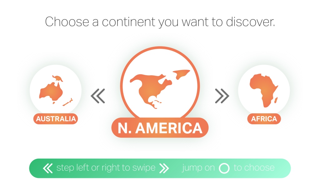
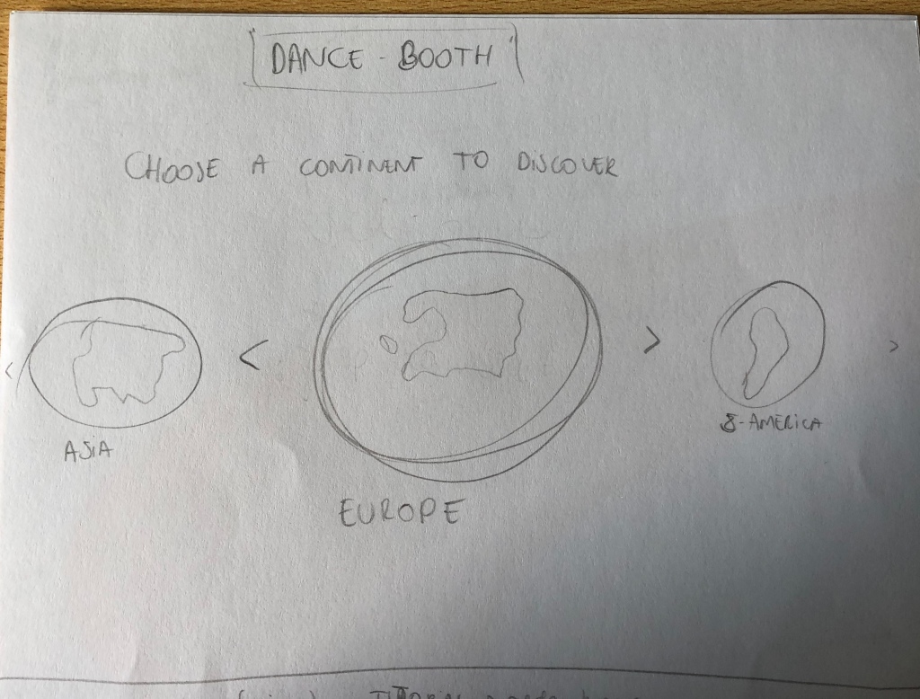
This could be the start screen. We start from the continents to discover the different dances and cultures.
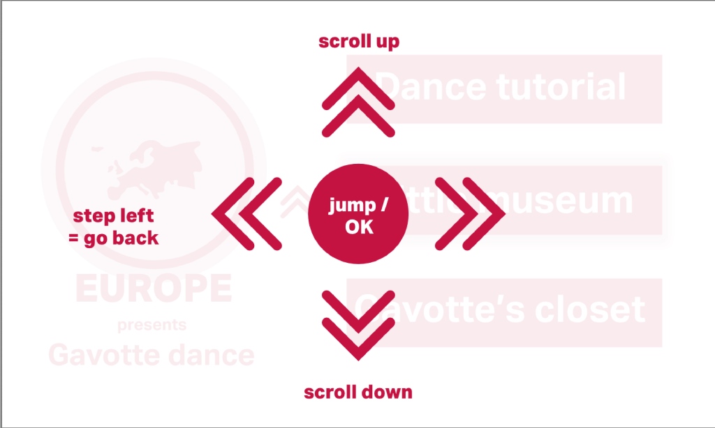
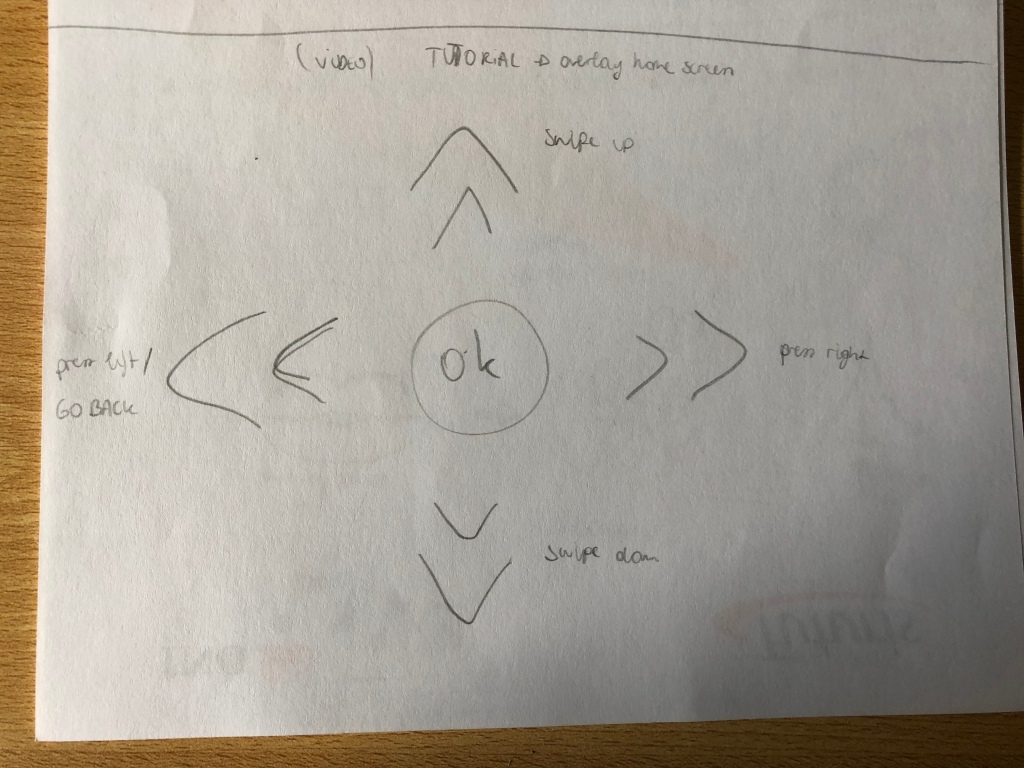
Of course a user manual is essential. As an overlay over the home screen, it explains how the player can control the screen.
This is an example of what is available per continent. There will be an explanation about the dance of that continent in any case. Then the player can choose to get more information in “The little museum”, to discover the dress style in “The closet” or to take a dance tutorial.
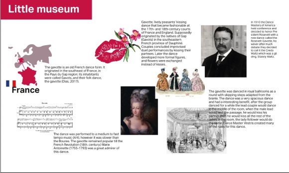
Here we come to the screen of “The little museum”. The player can scroll through the information using dance steps. It just stands next to each other and is supported by illustrations and pictures.
Then we come to “The closet”. Here we first take a picture of the player. Then the player can “dress up” with clothes that are associated with that dance or culture.
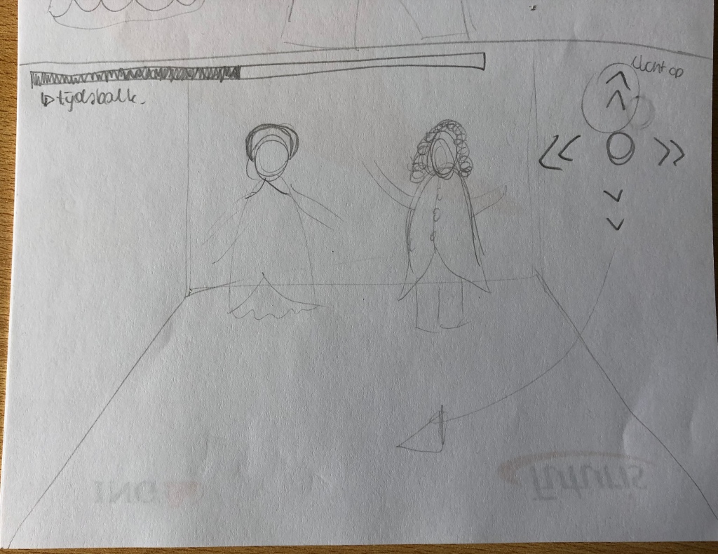
And finally there is the tutorial. Here the player can copy the dance steps that appear on the screen. Luckily, the arrows on the ground light up and appear on the screen as well. At the top of the screen there is a timeline so the player can see how long it will take.
I have to further develop these elements in different wireframes. Now I have to see which steps are necessary to reach something. How can we make it clear to the player each time how to control the screen? And which interface fits best?
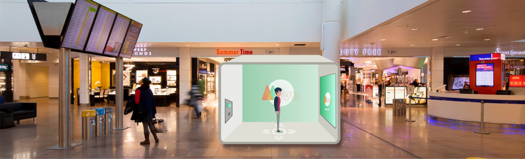
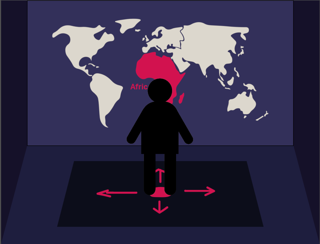
So the concept is a dance booth in an airport terminal. Travellers can obtain information from different dances per continent and perform these themselves. The special thing about this booth is that they have to control it with ‘dance steps’. If you want to push to the right on the screen, you have to make a step to the right like the example below. The screen is controlled by tracking of the movements from the participant. The control will be as simple as possible.
It is important, that the user flow is well worked out. The participants need to know what they need to do to achieve their goal.
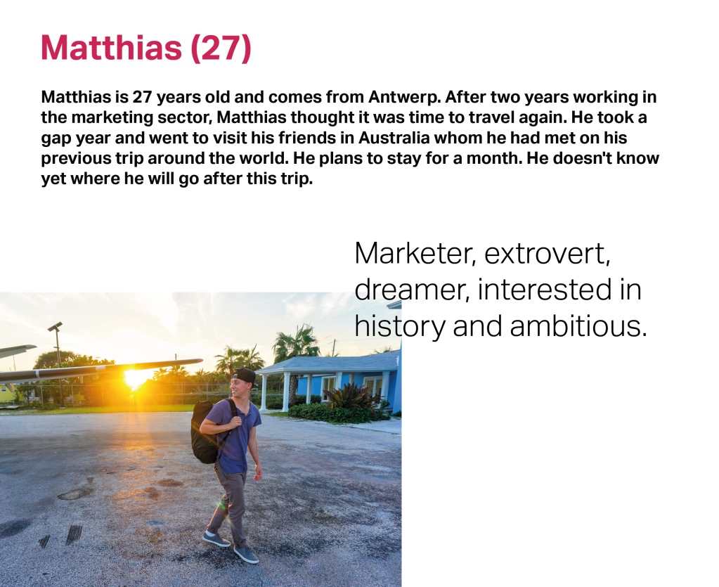
I made two personas that would take a look inside the booth while waiting at the airport.
A context scenario with Agnes would look like this:
Agnes reads the short explanation on the outside of the booth and goes inside
She sees the arrows on the ground and stands on the circle.
She activates the screen by jumping in the circle. She scrolls between the continents and chooses her own destination: South America.
In the museum she reads information about the origins of the dance Salsa. She had already done a lot of research on South America so she already knew a few facts.
Then she chooses an outfit in the closet and shares a picture via Instagram.
Finally she does the dance tutorial. Because she didn’t fully understand the steps at first, she does it again. Hopefully she will remember these dance steps when she is in Brazil!
She goes back to menu and then takes her stuff out of the booth, checks Instagram again for reactions to her picture and goes to her gate.